Applesmartphone2021
Apple iPhone 13
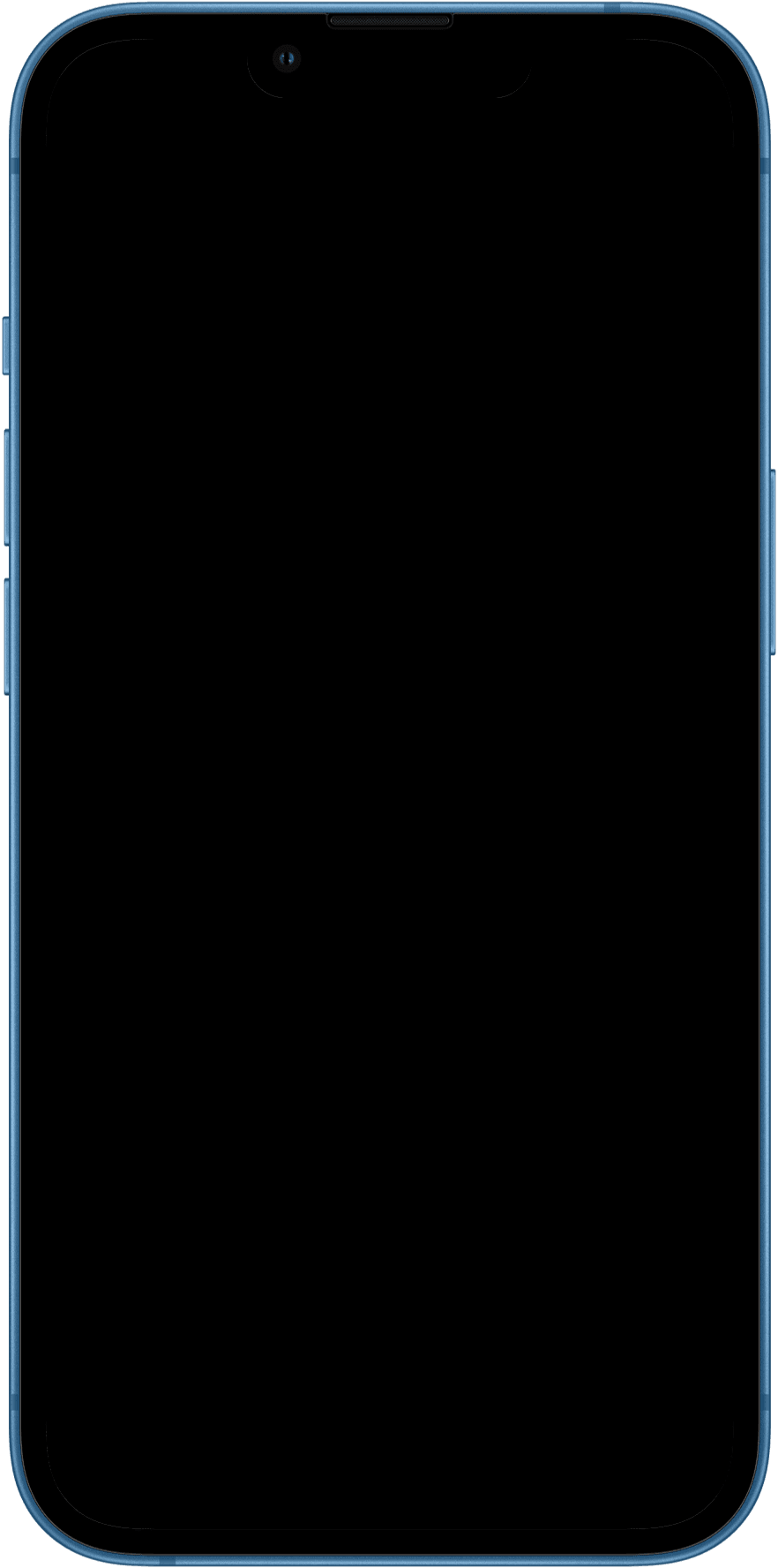
Complete CSS viewport dimensions, device pixel ratio, physical screen specs, and downloadable high-resolution transparent mockup.
CSS Viewport
390 × 844px
Physical Resolution
1170 × 2532px
Device Pixel Ratio
@3xDPR
Diagonal Screen
6.1"(15.49 cm)
Aspect Ratio
19.5:9
Pixel Density
457PPI
Hardware & System Profile
Operating SystemiOS 16.0
Rotation SupportedYes (Portrait & Landscape)
Network Simulation5G
Screen CurvatureFlat Display
Device User-Agent String
Use this string in Chrome DevTools or curl to simulate this exact device.
Mozilla/5.0 (iPhone; CPU iPhone OS 16_0 like Mac OS X) AppleWebKit/605.1.15 (KHTML, like Gecko) Version/16.0 Mobile/15E148 Safari/604.1
CSS Media Query
Target Apple iPhone 13 precisely with CSS media rules.
Portrait Mode
@media only screen
  and (min-device-width: 390px)
  and (max-device-width: 390px)
  and (-webkit-min-device-pixel-ratio: 3) {
  /* Apple iPhone 13 (Portrait) */
}
Landscape Mode
@media only screen
  and (min-device-width: 844px)
  and (max-device-width: 844px)
  and (-webkit-min-device-pixel-ratio: 3) {
  /* Apple iPhone 13 (Landscape) */
}
Free Chrome Extension
Test your website on Apple iPhone 13 in 1 click
Install the Responsive Viewer extension to simulate Apple iPhone 13's 390×844 viewport and DPR directly on any active browser tab.